Wednesday, June 8, 2011 2:36 PM
 On June 6 Nintendo pushed out its e-Shop update to all 3DS owners with connected devices. From head to toe, this is a more streamlined digital marketplace than the one featured on the 3DS' predecessor. But while there's a lot of good, rational stuff in the e-Shop, the marketplace as a whole still doesn't stack up well against the App Store.
The App Store, whether you love or hate its bulkiness and constant deluge of releases large and small and bad or good, is a better experience. Tools like "What's Hot," "Staff Favorites," and "New and Noteworthy" do an acceptable job at pointing at the next big thing. Its search is simple, sharp, and intuitive and its genre or hook-based splash pages are often valid little storefronts themselves.
To its credit, the e-Shop has similar tools, but they're all contained within a blade-based UI that is, already, cumbersome and flooded to the extent that it's hard to find the good or the unique in the store. For example, Plants vs. Zombies [$2.99 / HD] is available now, but where is it? This is a fantastic joint on the DS platform as well and it's sadly not being featured in the front of the store or in an easily discoverable place, as it should be.

Oh wait � it's tucked beyond all the first-party releases, which conveniently for Nintendo, are all featured prominently at the front of the e-Shop.
The e-Shop has a "Staff Pick of the Week." This week it's Cave Story. Behind this listing a few panels back there's a "Charts" category, as well as a "Recent Arrivals." To the right is a mess of featured games followed by a senseless "Games Shown at E3" category.
Finally, after this, there's the "Virtual Console" category and a mess of genre-based or non-specific listings. "Puzzle Games" and "Card Games" make sense, but then there's the "2-Player Games" category, "4-Player Games," the "Essential Games" listing and so on, which are all choked with a mishmash of releases. PVZ is in this latter category.
All of these blades give consumers more options to look through and further breakdowns, which if anything, is better than what the DSi offered. There's also a welcome search bar at the bottom of the screen… but you have to know what's out to find it.
Nintendo has ditched the points contrivance. Now, games cost real money and not Nintendo Banana Dollars which you get in exchange for real currency. Also, it looks like developers will have a lot more control over price points; I'm noting quite a few $1.99 downloads.
 Those are cool changes, but I think the e-Shop needs work. It needs better, more concise categorization. It also needs to dump the blade interface in favor of something that uses both screens on the device. Right now, the bottom screen is the only one that reveals meaningful data. That's a waste of screen real estate. I'd also like to see the first-party marketing stuff take a hike; "Games of E3" and "3DS Games Coming Soon" are taking up precious space that could be used for more categorization.
The mouse and keyboard interface of the App Store will always be better. I get that. But the e-Shop is just two days old and has, maybe, just over three hundred releases that are already hard to find. What's this going to be like six months from now?
The existence of some of these more streamlined e-Shop features indicated that Nintendo is listening to consumer feedback. I just wonder if it'll keep listening, or if we'll need to wait until the next handheld to find the downloadable games we all want to play.
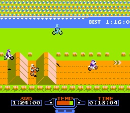
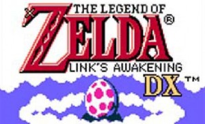
On a related note, the e-Shop is offering a "3D Classic" version of Excitebike free of charge until late this July. It's the original 2D and with the 3D slider, you can change the perspective of the background. It tilts. You can find this at the front of the store. The Legend of Zelda Link's Awakening DX is also available for purchase. It's an awesome game and it continues to look and play great on the 3DS. This is also at the front of the store.
<!-- PHP 5.x -->


Comments (0)
Post a Comment